

Begin Iconology
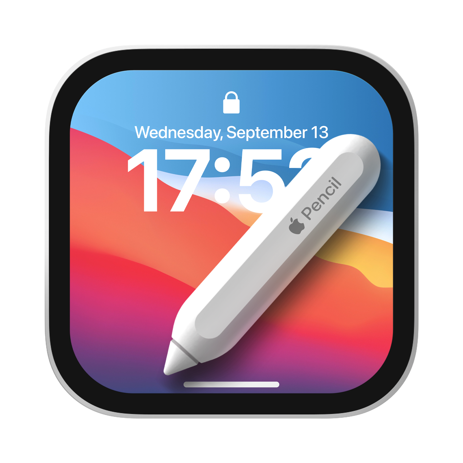
Why Icon?
Icons are essential to everyone's life in any context: from public transportation and restroom signs to those on consumer electronics and mobile devices. Because of this, it is crucial that each app and game has its own professionally designed and unique icons to help users locate your app or game in the App Stores and on their devices.
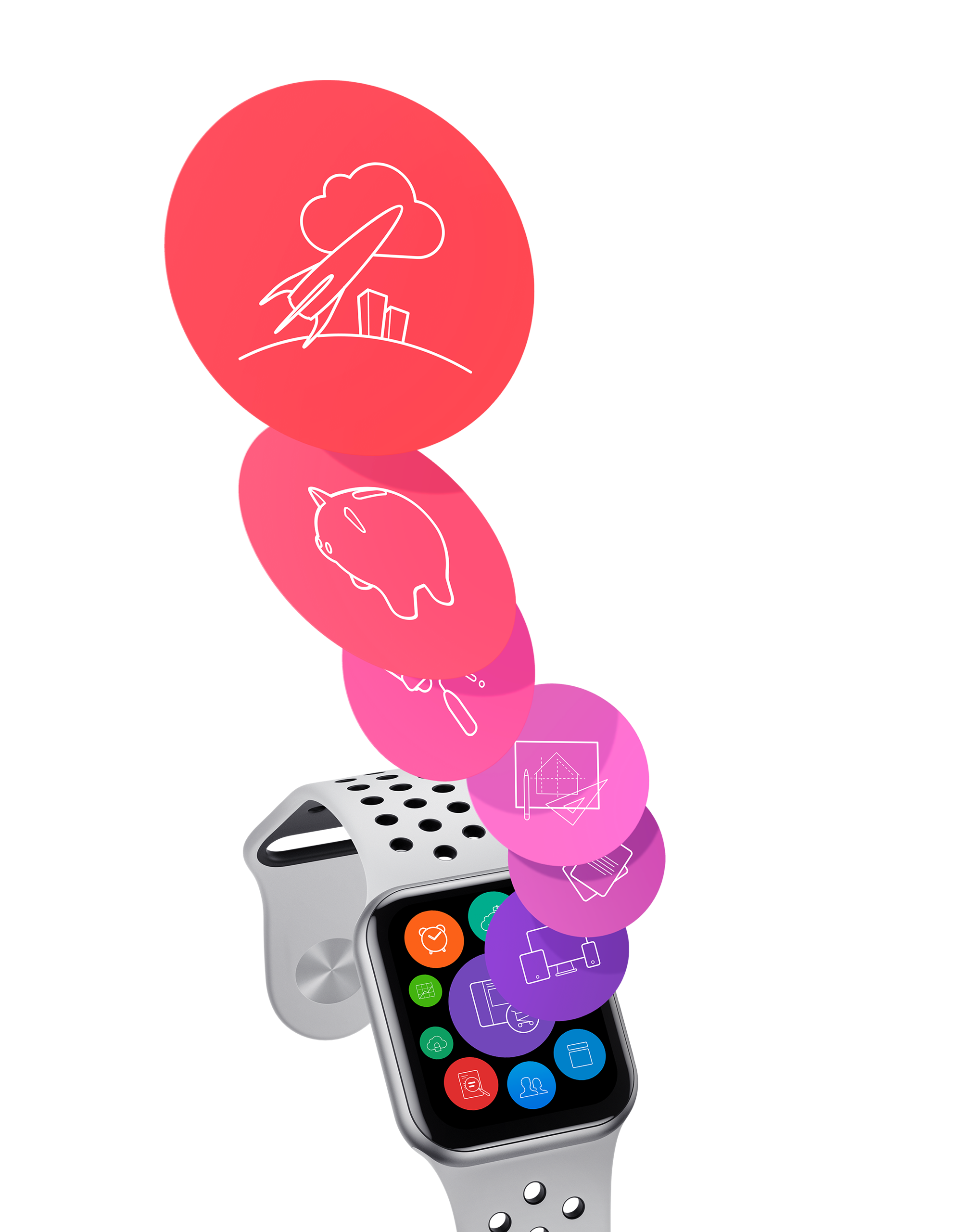
Stimulate the curiosity
Icons' conspicuous appearance provides efficient methods to transmit complicated information across comparable apps without needing users to differentiate, despite the fact that there may be many aspects, including the user experience and efficacy of the applications. Using this method, you have more room to show off your applications' unique personalities and stimulate consumers' curiosity.
What's new?
Discover the latest editions and updates of the icon creations I've made.
I take great pleasure in exploring the meaning behind each symbol, designing it with care, and facilitating its use.
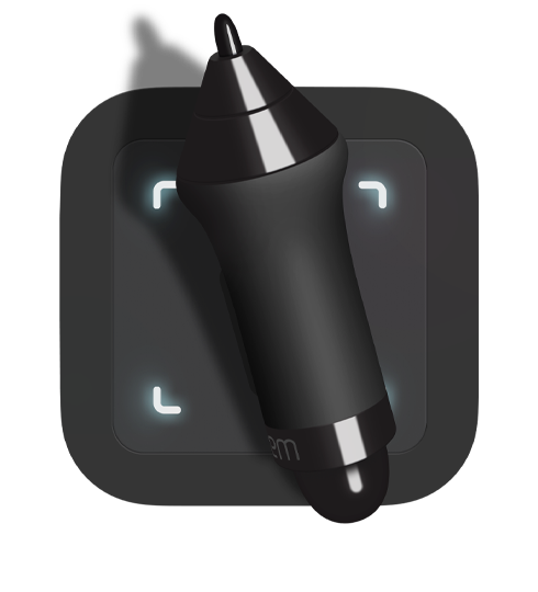
Wacom Intuos
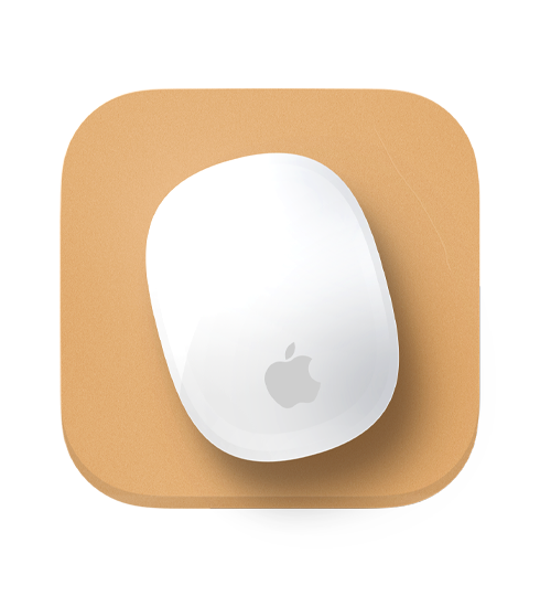
Apple Mouse

My Library
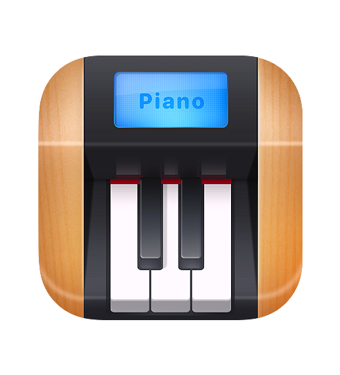
Mini Piano

Akira's friend ``PiPi``

Akira Myo
I use Human Interface Guidelines as a mantra while enhancing the aesthetic appeal of every single icon in order to provide ideas and actions more efficiently. Because they can bring several benefits such as the attraction of the user interface and the best user experience for the applications.
Variations
In fact, there are many different shapes and variations in icon creation, from simple to sophisticated and intricate designs on the canvas area of a single icon. From there, you need to carefully select icons compatible with the application you will create.
Be sure to create a variety of variations: spacing between each element, thickness of lines, and color choices, and then choose the best one. The impression of custom and adorned symbols is longer lasting and more likely to be remembered for years. Two such examples are the Safari browser icon and the GarageBand icon. Instances of this include Safari and the Garageband Icons.

Simplicity or detail
Let's see the following examples of variations. Several icons shown below are more easily understood and recognized by the general audience. Right? A pen or pencil with a paper or device. But what is that? Diary/ note app? We still don't know yet.
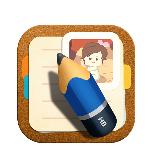
Chibi style icon
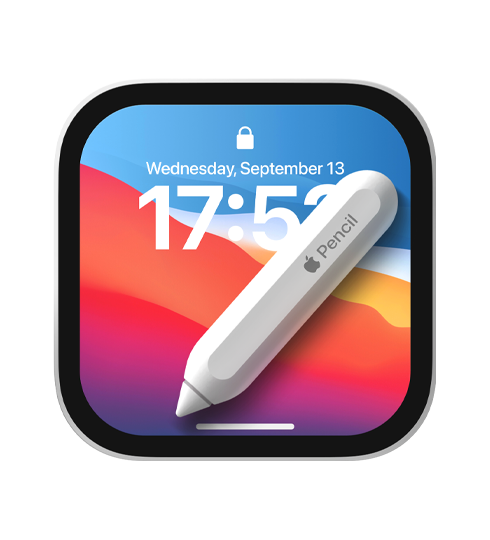
Chibi style tech-related icon
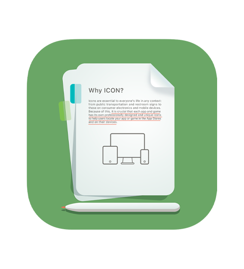
Conventional Icon

Sign-based outlined icon
Simplicity or minimalism is the best practice because too many details and elements in a icon's canvas may make it difficult to see and give the impression of visual distortion, particularly at smaller sizes. Nonetheless, there will be aesthetic resemblance to other applications (apps). Therefore, it is crucial to perform thorough research and practice before creating an icon.



I am ready to be involved in your firm to apply my experiences in digital creations that integrate seamlessly with various platforms.
Terms of Use | Privacy Notice | Copyright © 2023. MYO HAN HTUN | All rights reserved.